
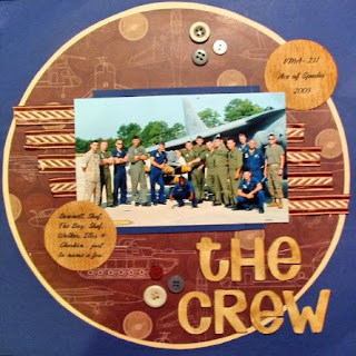
This page was done with sketch #43 from 52 sketches, 52 weeks. I usually participate every week with them, but I'm a little behind. I haven't done it in a few weeks. The letters that I used for the title were using a font called: "Too Much Paper". I love that font. I make faux chipboard letters by printing the letters out 4 times each (would've done 5 usually, but ran out of that color cardstock). Then I glued them one on top of another. I distressed them with Tim Holtz "brushed corduroy" inks.

Tamara...this is awesome!!! How did you cut the big circle? Love the layout. I am not a scrapbooker, but I need to become one. My beloved photos are not happy in their shoebox. I think I will add your sketch to a new folder on my C drive called scrapbook layouts. Great, another thing I don't have time for. Too bad I have 20 years til retirement...too much fun stuff I want to do, but work gets in the way!! Love your blog. Hisses, Rockin Robin Caldwell (stampinsavage at yahoo dot com)
ReplyDelete